Choosing A Color Scheme For Your E-Commerce Store
 Starting an e-commerce store requires lots of thought and preparation. You have to create a business plan, a marketing strategy, research your target audience and competitors, and more. With all of the financial aspects you have to work on, it’s easy to neglect something like graphic design. But don’t forget about your store’s appearance—the look of your site can make or break a sale or conversion. Would you rather buy from a site that looked unprofessional or a polished site that was easy on the eyes and guided you through your purchase?
Color scheme is probably the biggest factor in a site’s appearance. So let’s look at some tips to help you craft a site that will draw people in and make them trust your brand.
Color Theory
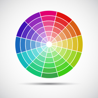
There are a few color theory basics to get down when you’re starting to design your site. Color theory is basically the way colors relate to one another and the color wheel organizes and categorizes these relationships. The primary colors are red, yellow, and blue. Secondary colors are created by mixing primary colors and include green, orange, and purple. Tertiary colors are more nuanced color mixes and include shades like red-orange, yellow-green, red-violet, etc. Whites, blacks, and grays are considered neutral colors. Keep these basics in mind as we dive into a few design options for your website.
Monochromatic Color Scheme
Monochromatic color schemes involve choosing one main color for your entire site, and then creating other shades and variations of that same color for any other aspects of the site. This type of color scheme is easy and beginner-friendly. Use light and dark contrast to show promotions or special offers. Photos and neutral colors like gray can be used to supplement the design. Monochromatic schemes provide a cohesive, unified look to a site.
Analogous Color Scheme
Colors that are adjacent on the color wheel are known as analogous colors. These colors provide a muted and affable look to a site. It’s hard to go wrong with the softer effects that an analogous color scheme offers. You may want to try this in your design if other color schemes look overpowering. Use groups of two or three analogous colors and don’t forget that you can use varying shades of the same color for this as well.
Complementary Color Scheme
Complementary colors are ones that are opposite each other on the color wheel—blue and orange, yellow and purple, red and green, etc. These colors provide contrast and can really make your design distinctive. This design manages to create harmony and stand out at the same time. Some people may find an entire design based around complementary colors a bit overwhelming for their brand. If you feel this is the case for your business, you can just use complements for certain aspects of your site, like a call to action button.
Remember that your branding revolves around how people recall your business. This includes the imagery they associate with your site. Good color schemes stick out to people and help them remember certain businesses and brands over others. So be sure you don’t skimp out on your e-commerce store’s visual design. If you need any help with your e-commerce business, don’t hesitate to let us know. We’d be happy to assist you!